As more businesses rely on analytics to make critical decisions, the field of analytics itself continues to evolve. No longer are businesses finding spreadsheets a useful way to draw insights from raw data. The Art of Analytics is becoming more common as people realise the benefits of seeing relationships and patterns through a picture.
Put simply, the art of analytics is turning data into images so users can see patterns and anomalies sooner, making decisions faster.
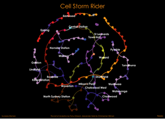
The image above maps the Sydney train journey of a Teradata researcher. The train ride is tracked through the researcher’s mobile phone tower connections, represented by the coloured dots (nodes). This visualisation was created using Teradata Aster and Aster App Centre. Geospatial analytics were included using the geo location data for train stations and cell towers.
This project represents the potential of a new form of analytics that uses mobile phone data to study traffic patterns caused by the movement and mass congregations of people. The data can be used to optimise cell tower networks to avoid performance issues and improve the customer experience.
It also supports emerging data on monetisation initiatives where detailed traffic flows can be used for urban planning, retail store location analysis, and marketing offers.
In this analysis, the researcher was looking for cell signal ‘storms’ that can overwhelm the towers and affect performance. As crowded commuter trains run down the lines and pool at stations, they sent out thousands of signals that move rapidly across the towers. By overlaying tower performance data, commuter-traffic volumes, and tower hand-offs, the project can pinpoint cell signal ‘storm surges’, enabling detailed recommendations to optimise the network.
Being able to see the data in such a clear way lets decision makers see these patterns at a glance, supporting faster, more accurate decision-making.
Data scientists are also finding the Art of Analytics helpful when it comes to explaining big data patterns. People can better comprehend relationships in data through pictures rather than just numbers.


